📂
SEI 1019
  • Introduction
  • About These Notes
  • Syllabus
  • Development Workflow
    • Command Line
      • The Terminal
      • Filesystem Navigation
      • File Manipulation
      • Additional Topics
    • Intro to Git
      • Version Control
      • Local Git
      • Remote Git
      • Git Recipes
    • Group Collaboration
      • Git Workflows
      • Project Roles and Tools
    • VS Code Tips & Tricks
  • HTML/CSS
    • HTML
    • CSS Selectors
    • CSS Box Model and Positioning
      • Box Model
      • Display and Positioning
      • Flexbox
      • Grid
      • Flexbox & Grid Games
      • Floats and Clears
      • Additional Topics
    • Advanced CSS
      • Responsive Design
      • Pseudo-Classes/Elements
      • Vendor Prefixes
      • Custom Properties
      • Additional Topics
    • Bootstrap
    • CSS Frameworks
    • Accessibility
  • JavaScript
    • Primitives
    • Arrays
    • Objects
    • Control Flow
      • Boolean Expressions
      • Conditionals
      • Loops
      • Promises
    • Functions
      • Callbacks
      • Timing Functions
      • Iterators
    • DOM and Events
    • DOM Manipulation
    • HTML5 Canvas
    • How To Reduce Redundancy
    • (2019) JavaScript OOP
    • (2016) OOP with Classes
    • (1995) OOP with Prototypes
      • Constructors
      • Prototypes
    • Intro to TDD
    • Scoping
    • Inheritance
      • Prototypal Inheritance
      • Call, Apply, and other Functions
      • ES6 Inheritance
      • Resources
    • Custom Node Modules
    • Additional Topics
      • AJAX, Fetch, and Async/Await
      • AJAX w/JSON and Localstorage
        • AJAX w/JSON
        • Local Storage
      • Async module
      • Data Scraping
  • jQuery
    • Intro
      • DOM Manipulation
      • Reddit Practice
      • Styling
      • Events
    • Plugins
    • AJAX
  • APIs
    • Fetch
    • AJAX w/jQuery
    • AJAX w/Fetch
  • Databases
    • Intro to SQL
    • Advanced SQL
    • MongoDB
      • Intro to NoSQL
      • CRUD in MongoDB
      • Data Modeling
      • Intermediate Mongo
  • Node/Express
    • Node
      • Intro to Node
      • Node Modules
      • Node Package Manager (NPM)
    • Express
      • Intro to Express
        • Routes
        • Views
        • Templates
        • Layouts and Controllers
        • CRUD & REST
          • Get and Post
          • Put and Delete
      • APIs with Express (request)
      • APIs with Express (axios)
    • Sequelize
      • Terminology
      • Setup
      • Using Models
      • Seeding Data
      • Validations and Migrations
      • Resources
      • 1:M Relationships
      • N:M Relationships
    • Express Authentication
      • Research Components
      • Code Components
      • Auth in Theory
        • Sessions
        • Passwords
        • Middleware
        • Hooks
      • Auth in Practice
        • Create the User
        • User Signup
        • Sessions
        • User Login
        • Authorization and Flash messages
    • Testing with Mocha and Chai
    • Mongoose
      • Mongoose Associations
    • JSON Web Tokens
      • Codealong
    • Additional Topics
      • oAuth
      • Geocoding with Mapbox
      • Geocoding and Google Maps
      • Cloudinary
      • Websockets with Socket.io
      • SASS
  • Ruby
    • Intro to Ruby
    • Ruby Exercises
    • Ruby Classes
    • Ruby Testing with Rspec
    • Ruby Inheritance
    • Ruby Data Scraping
  • Ruby on Rails
    • Intro to Rails
    • APIs with Rails
    • Asset Pipeline
    • Rails Auth and 1-M
      • Auth Components
    • Rails N:M
    • ActiveRecord Polymorphism
    • Additional Topics
      • oAuth
      • SASS
      • Rails Mailers
      • Cloudinary
      • Jekyll
  • React (Updated 2019)
    • ES6+/ESNext
      • Const and Let
      • Arrow Functions
      • Object Literals and String Interpolation
      • ES6 Recap
      • ES6 Activity
    • Intro to React
      • Create React App
      • Components and JSX
      • Virtual DOM
      • Props
      • Dino Blog Activity
      • Nested Components
      • Lab: LotR
    • React State
      • Code-Along: Mood Points
      • Code-Along: Edit Dino Blog
      • Lab: Simple Calc
      • Lifting State
    • React Router
      • Browser History/SPAs
      • React Router (lesson and full codealong)
      • Router Lab
    • Fetch and APIs
      • APIs with Fetch and Axios
      • Fetch the Weather
    • React Hooks
    • React LifeCycle
      • Lab: Component LifeCycle
    • React Deployment
    • Additional Topics
      • React Frameworks
        • Material UI Theming
      • Typescript
        • More Types and Syntax
        • Tsconfig and Declaration Files
        • Generics with Linked List
      • Redux
      • TypeScript
      • Context API
      • React Native
  • Meteor
  • Deployment and Config
    • Installfest
      • Mac OSX
      • Linux
      • Git Configuration
      • Sublime Packages
    • Deploy - Github Pages
    • Deploy - Node/Sequelize
    • Deploy - Node/MongoDB
    • Deploy React
    • Deploy - Rails
      • Foreman (Environment Variables)
    • Deploy - AWS Elastic Beanstalk
    • Deploy - S3 Static Sites
    • Deploy - Django
    • Deploy - Flask
  • Data Structures and Algorithms
    • Recursion
    • Problem Solving - Array Flatten
    • Binary Search
    • Algorithm Complexity
    • Stacks and Queues
    • Bracket Matching
    • Ruby Linked Lists
      • Sample Code
      • Beginner Exercises
      • Advanced Exercises
    • JS Linked Lists
      • Sample Code
      • Beginner Exercises
      • Beginner Solutions
    • Hash Tables
    • Intro to Sorting
    • Insertion Sort
    • Bucket Sort
    • Bubble Sort
    • Merge Sort
    • Quick Sort
    • Heap Sort
    • Sorting Wrapup
    • Hashmaps
    • Trees and Other Topics
  • Python
    • Python Installation
    • Intro to Python
    • Python Lists
    • Python Loops
    • Python Dictionaries
    • Python Sets and Tuples
    • Python Cheatsheet
    • Python Functions
    • Python Classes
    • Python Class Inheritance
    • Intro to Flask
    • Intro to SQLAlchemy
      • Flask and SQLAlchemy
    • Using PyMongo
    • Intro to Django
    • CatCollector CodeAlong
      • URLs, Views, Templates
      • Models, Migrations
      • Model Form CRUD
      • One-to-Many Relations
      • Many-to-Many Relations
      • Django Auth
    • Django Cheatsheet
    • Django Auth
    • Django Polls App Tutorial
    • Django School Tool Tutorial
    • Django 1:M Relationships
    • Custom Admin Views
    • Data Structures and Algorithms
      • Recursion
      • Binary Search
      • Stacks and Queues
      • Linked Lists
      • Binary Trees
      • Bubble Sort
      • TensorFlow & Neural Networks
    • Adjacent Topics
      • Raspberry Pi
      • Scripting
  • Assorted Topics
    • History of Computer Science
    • Regular Expressions
    • Intro to WDI (Course Info)
    • Being Successful in WDI
    • Internet Fundamentals
      • Internet Lab
    • User Stories and Wireframing
      • Wireframing Exercise: Build an Idea
    • Post WDI
      • Learning Resources
      • Deliverables -> Portfolio
      • FAQ
  • Projects
    • Project 1
    • Project 2
    • Project 3
      • Project 3 Pitch Guidelines
    • Project 4
    • Past Projects
      • Project 1
      • Project 2
      • Project 3
      • Project 4
      • Portfolios
    • Post Project 2
    • MEAN Hackathon
      • Part 1: APIs
      • Part 2: Angular
    • Portfolio
  • Web Development Trends
  • Resources
    • APIs and Data
    • Tech Websites
    • PostgreSQL Cheat Sheet
    • Sequelize Cheat Sheet
    • Database Administration
  • Archived Section
    • (Archived) ReactJS
      • Intro to React
        • Todo List Codealong
        • Additional Topics
      • Deploy React
      • React with Gulp and Browserify
        • Setting up Gulp
        • Additional Gulp Tasks
      • React Router
        • OMDB Router
        • OMDB Search
        • Additional Resources
      • React Animations
        • CSS Animations
    • AngularJS
      • Intro to AngularJS
        • Components and SPA
        • Create an Angular App
      • Angular Directives and Filters
      • Angular Animation
      • Angular Bootstrap Directives
        • Bootstrap Modals
      • Angular $http
      • Angular Services
        • Service Recipes
        • ngResource
        • Star Wars Codealong
      • Angular Routing
      • Angular + Express
      • Angular Authentication
        • Additional Topics
      • Angular Components
      • Angular Custom Filters
      • Angular Custom Directives
Powered by GitBook
On this page
  • Examples of responsive sites:
  • The Web has always been responsive
  • Making Responsive Webpages
  • The Viewport
  • Media Queries
  • Anatomy of a Media Query
  • A More Useful Example...
  • An Example Using CSS Grid...
  • A note about where to set breakpoints
  • Conclusion
  • Additional Reading
  • Columns Example

Was this helpful?

  1. HTML/CSS
  2. Advanced CSS

Responsive Design

PreviousAdvanced CSSNextPseudo-Classes/Elements

Last updated 4 years ago

Was this helpful?

"Responsive Design" is the strategy of making a site that "responds" to the browser and device that it is being shown on... by looking awesome no matter what.

You can also check out this visual explanation:

Examples of responsive sites:

Non-responsive sites

You'll be hard-pressed to find a major website that doesn't deal with mobile devices somehow. Reddit isn't specifically responsive, but you do have the option of switching to a mobile-optimized site.

If you look at the Reddit site on your phone, try selecting "mobile site" from the site map at the bottom of the page. How does this change your experience?

The Web has always been responsive

From the beginning, the web has been meant to be shown on a variety of different screens.

  • Text wraps

  • Floats automatically position themselves based

    on screen size

  • percentage sizing

If we go to this simple example, we see that floats reflow, depending on screen width. Likewise, the paragraphs remain at 50% of screen width, no matter what this screen width is.

See the Pen by Brian Hague () on .

Basic CSS only gets us so far and can seriously restrict how we structure the layout of the page.

Making Responsive Webpages

The Viewport

When web developers started creating sites for mobile, they had problems with displaying pages that were initially created for desktops. They were too large! The quick fix was to scale pages to fit the screen, but we ended up getting results like this:

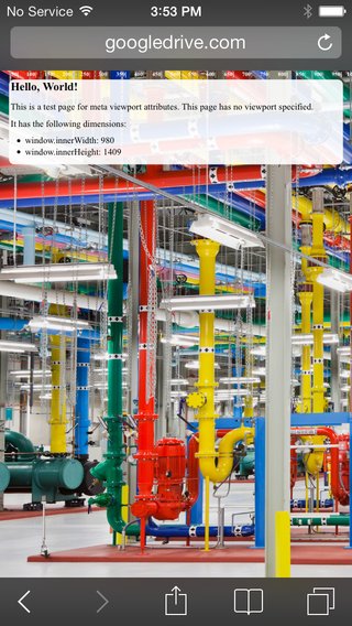
Yikes, that's hard to read on a small device. The solution is that we need to control the width and the zoom level of the page.

When creating sites for mobile (which you should almost always do), we want to control the page width and zoom level of the browser using the viewport tag:

<meta name="viewport" content="width=device-width, initial-scale=1">

Doing so will give us something like this:

Media Queries

Media queries are simply a way to conditionally apply styles based on the device the page is being displayed on.

We already know that if we do something like this:

p {
  color: red;
}

p.blue_text {
  color: blue;
}

By default, all p tags will have red text, unless they have the class blue_text, in which case, the text will be blue. We can do a similar thing with media queries.

p {
  color: blue;
}

@media (min-width: 600px) {
  p {
    color: red;
  }
}

Now, all p tags will be red, until the screen size reaches 600px, when they'll turn blue. While this isn't super useful, it does demonstrate how we can apply styles conditionally when we meet certain device measurements.

Anatomy of a Media Query

The syntax is quite a bit different than normal CSS so let's examine what we see here:

@media screen and (min-width: 600px)

Media queries always begin with @media. The second option you see there is the word screen. This tells the browser that we are interested in screen measurements. There are two others we could use instead of screen: print is used to apply styles when the document is being printed, and speech is used to apply styles for screen readers. We'll mostly be using screen. You then need the word and to connect the the first test (whether we are on a screen) to the second test (whether the screen has a minimum width of 600px.) That last test is always in parentheses and always takes the form of a CSS property-value pair.

You can chain multiple tests onto your media query. For example, you wanted to apply styles between a min-width of 600px and a max-width of 900px, your code would look like this:

@media screen and (min-width: 600px) and (max-width: 900px) {
  /* some styles here... */
}

A More Useful Example...

A potentially more useful example would be to float all list items left until a certain screen size, then revert the list items to block, causing them to stack.

li {
  display: block;
  color: blue;
}

@media (min-width: 600px) {
  li {
    display: inline-block;
    color: red;
  }
}

Along with min-width, you can also provide max-width to a media query, as well as combine different device orientations and resolutions. For example, here's a media query that will apply to the list elements between 600-1000px.

@media (min-width: 600px) and (max-width: 1000px) {
  li {
    display: inline-block;
    color: black;
  }
}

An Example Using CSS Grid...

We can also use media queries to control layouts when using Flexbox or Grid. We'll use them to change this layout from a single-column mobile layout to a multi-column desktop layout as the screen width increases. Let's use Codepen.io to make a very simple HTML page:

<header>header</header>
<aside>sidebar</aside>
<main>main</main>
<footer>footer</footer>

Codepen treats these as contained inside the body element directly. Now, let's define what our mobile experience will look like. It will be a single column so the CSS will look like this:

body {
  min-height: 100vh;
  margin: 0;
  display: grid;
  grid-template-rows: 80px 80px 1fr 80px;
  grid-template-columns: 1fr;
  grid-template-areas: "header"
                       "sidebar"
                       "main"
                       "footer";
}
header {
  background-color: red;
  grid-area: header;
}
aside {
  background-color: blue;
  grid-area: sidebar;
}
main {
  background-color: white;
  grid-area: main;
  min-height: 100px;
}
footer {
  background-color: gray;
  grid-area: footer;
}

So we have defined a grid with four rows and one column, a pretty standard layout for mobile. I gave the main section a minimum height so that it doesn't vanish on us while we are testing.

Now, using a media query, we can add a test for the times when the device width is as wide as on a laptop or desktop. When this test is true, the styles inside the media query will be applied and will override our mobile styles:

@media screen and (min-width: 900px) {
  body {
    grid-template-rows: 80px 1fr 80px;
    grid-template-columns: 200px 1fr;
    grid-template-areas: "header header"
                         "sidebar main"
                         "footer footer";
  }
}

The browser will still first apply all the styles that show up earlier in our CSS file. Then it encounters the media query. Think of this block as a conditional that first tests to see if the screen has a minimum width of 900px. If that is true, all the styles inside the block are applied. If it is not true, the enclosed styles are skipped.

The styles we have inside the media query change the layout to have 3 rows and 2 columns and then reposition the grid areas within the grid. We can view the changes by resizing our browser width.

A note about where to set breakpoints

A media query that we set for a specific width is known as a breakpoint. It is the point at which one set of styles stops being applied and another set takes over. You may be asking yourself, when do I make the styles change? Do I put in the widths of every device that exists to accomodate them all?

No, because that would be nearly impossible to maintain. You don't even need to plan for all the major screen sizes. Rather, you should let your design inform where the breakpoints should be. All modern designs should start with mobile styling first. Make it look good on mobile and then start expanding your page. How will you know when to add a breakpoint? You should add your first breakpoint at the width where things start looking shabby. If you widen your browser and eventually you feel that the single-column mobile layout looks overwhelmed by the amount of whitespace around it, then you should add a breakpoint right before the point where it starts detracting from the aesthetic. At this first breakpoint, change your styles to take advantage of the increased width. Maybe move some stuff into additional columns. Then repeat the process: widen the window until it no longer looks good. Then add another breakpoint to rearrange things until you like the look. Repeat until you have dealt with the largest width you will need to accomodate (today this is usually a 4K ultra-HD television).

Conclusion

Media queries are at the heart of every responsive design solution. While there are a few good CSS frameworks that include grid systems that we can use for laying out a responsive page (Bootstrap, Materialize, Skeleton, etc.), they are not a substitution for knowing how to use media queries well. While these frameworks work generally well for many, many web sites, eventually in your career you will find you need the control that only media queries can provide.

Additional Reading

Columns Example

No Viewport Meta Tag
Viewport Meta Tag

Much better! Pictures courtesy of

There are many, many bits of information about the environment that we can query. You can see a full list . However, for the most part, we will only be querying min-width and max-width from the screen.

See the Pen by Brian Hague () on .

http://johnpolacek.github.io/scrolldeck.js/decks/responsive/
Boston Globe
GA
Float demo
@bhague1281
CodePen
Google Developers
here
A Complete Guide To CSS Media Queries
7 Habits of Highly Effective Media Queries
Media Queries for Standard Devices
Brad Frost - Navigation Patterns for Responsive Design
Using Media Queries (MDN)
Media Queries
@bhague1281
CodePen